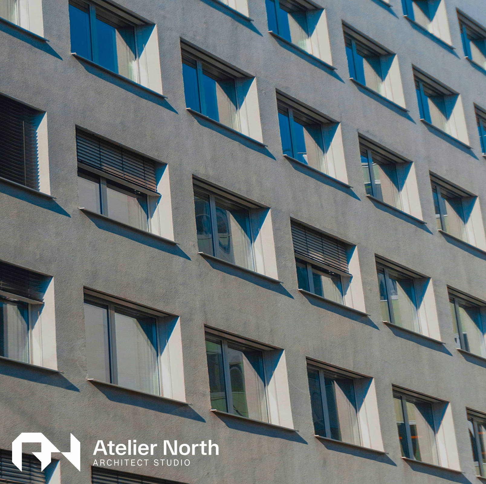
Atelier North

Atelier North is a modern architecture studio built on abstract ideas, clean forms, and thoughtful spatial design.

Year
2025
Services
Branding
Illustrations
Design
Summary

I designed the full identity for Atelier North, developing an abstract logo system, a refined colour palette, and a cohesive digital presence that reflects the studio’s blend of creativity, restraint, and architectural clarity.

The Challenge

The goal was to create a brand for an architecture studio that felt modern, intentional, and refined. Atelier North needed an identity that represented both their clean architectural style and the conceptual thinking that drives their work. The challenge was to capture this balance in a way that felt minimal, meaningful, and visually distinctive.

Brand Idea

The brand is built around the idea that strong architecture begins with simple abstract concepts. Atelier North approaches each project by shaping these ideas into practical, beautifully resolved spaces. The identity translates this process into a visual system that is calm, structured, and confident, reflecting their commitment to clarity, modern materials, and northern restraint.

Logo Showcase

The logo is the result of exploring many abstract forms inspired by layouts, elevations, and geometric compositions. Through multiple iterations, the final mark was refined into a set of interconnected shapes that subtly reference structure and space. It captures the studio’s belief in turning conceptual foundations into functional architectural solutions.

Colour Palette

The palette uses blue, black, and white to create a clean, modern foundation. Blue introduces a sense of clarity and protection, black adds contrast and structure, and white keeps the brand open and minimal. Together, these colours communicate precision and confidence while allowing the architectural work to take centre stage.

Brand Asset

The abstract shapes from the logo extend into the wider identity, acting as flexible containers and frames. Photography is placed within or emerging from these forms, creating a dynamic connection between concept and built environment. These shapes become a practical visual language that supports layouts, compositions, and storytelling across the brand.

Website Design

The website was designed with the same restraint and clarity as the brand itself. A clean layout, minimal typography, and structured spacing guide the user through each section. Subtle animations and transitions add a sense of craft without distraction, while the abstract shapes provide continuity throughout the digital experience. The result is a refined online presence that mirrors the studio’s architectural values.