The Velvet Lead
Belfast’s premium dog café, where specialty coffee meets muddy paws and wagging tails.
The Velvet Lead is a Dog friendly/centred café located in Belfast for this case study. It provides deals to customers and accommodation for pets.
Belfast’s premium dog café, where specialty coffee meets muddy paws and wagging tails.
The Velvet Lead is a Dog friendly/centred café located in Belfast for this case study. It provides deals to customers and accommodation for pets.
Belfast has seen a wave of modern cafés and brand refreshes in recent years. Few cafés truly embraced the needs of local dog owners.
For someone living in an apartment, walking the dog often meant heading straight to a park.
There was little reason to explore the city itself. The Velvet Lead was created to give owners a new destination, turning a simple walk into an enjoyable coffee stop for both human and pet.

The Velvet Lead is Belfast’s premium dog café. Designed with both people and pets in mind, the café balances sophistication with fun.
Offering customers indulgent coffee experiences while ensuring their dogs feel equally welcome and cared for.
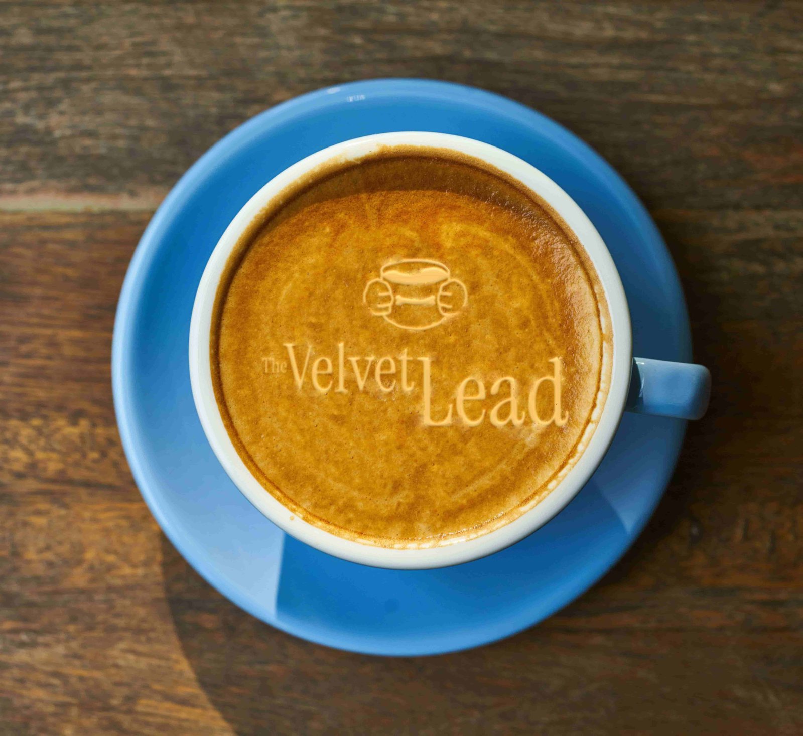
The logo combines the clean elegance of Instrument Sans with hand-drawn doodles of two paws holding a coffee cup. This pairing reflects the brand’s dual personality: refined and luxurious on one side, playful and carefree on the other.
The result is a mark that captures both the café’s premium feel and its canine heart.
The identity uses just two colours, Velvet (a deep red) and Cream.
This stripped-back palette reflects the look of ink on a napkin, keeping the illustrations simple and authentic.
By limiting the colours, the brand balances elegance with playfulness while letting the café’s characterful sketches stand out.
The illustrations are drawn in a recognisable line style with selective red fills on key objects or details. This approach creates consistency across the brand while keeping the playful, hand-drawn character intact.
The website was designed to fully reflect the brand identity by using only the custom illustrations created for The Velvet Lead. Introducing photography of a café interior would have broken this consistency and weakened the visual impact of the brand. To keep the experience engaging, I added bespoke animations that guide the user through each section and illustration, making the site feel lively, playful and true to the café’s character.
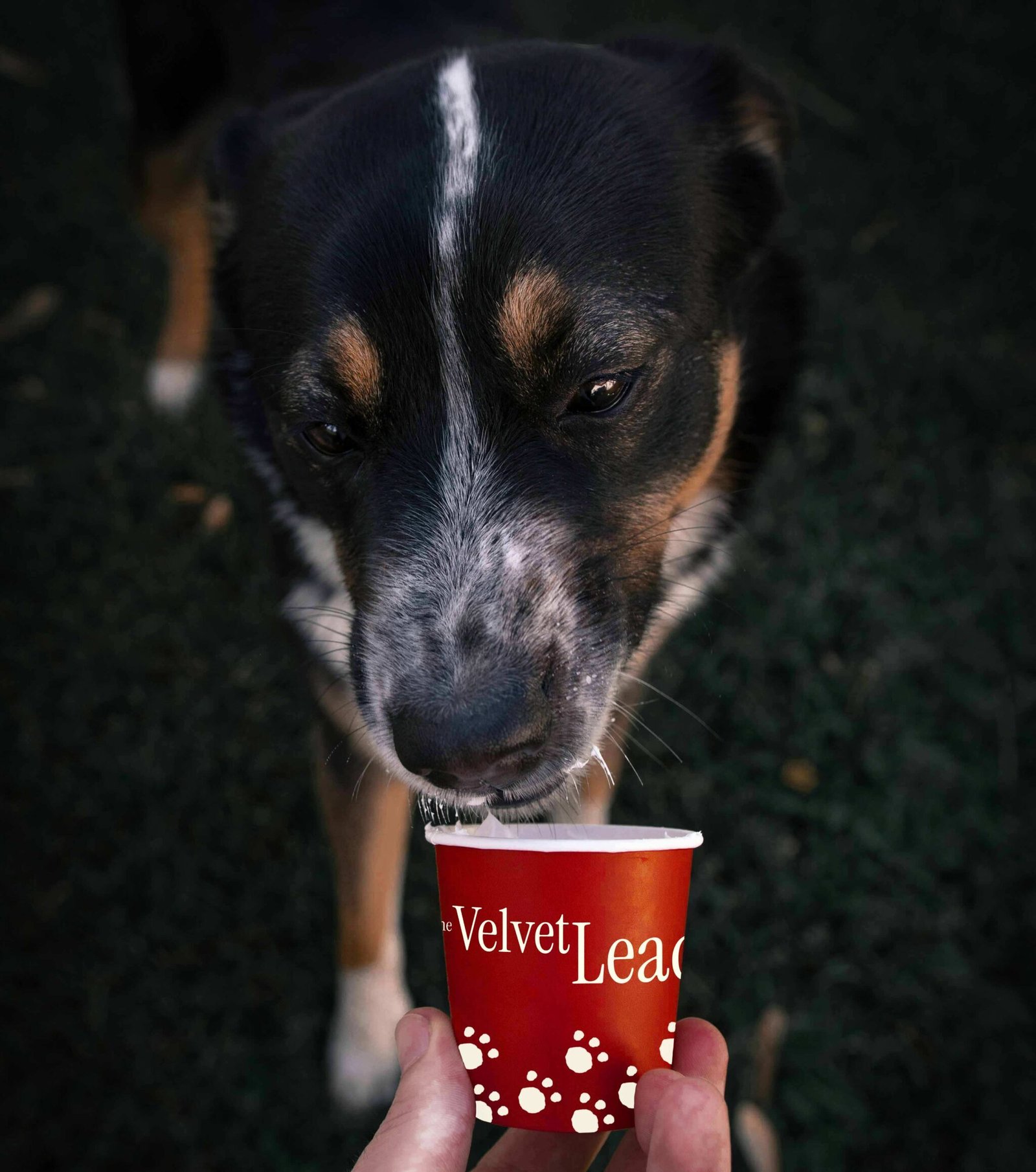
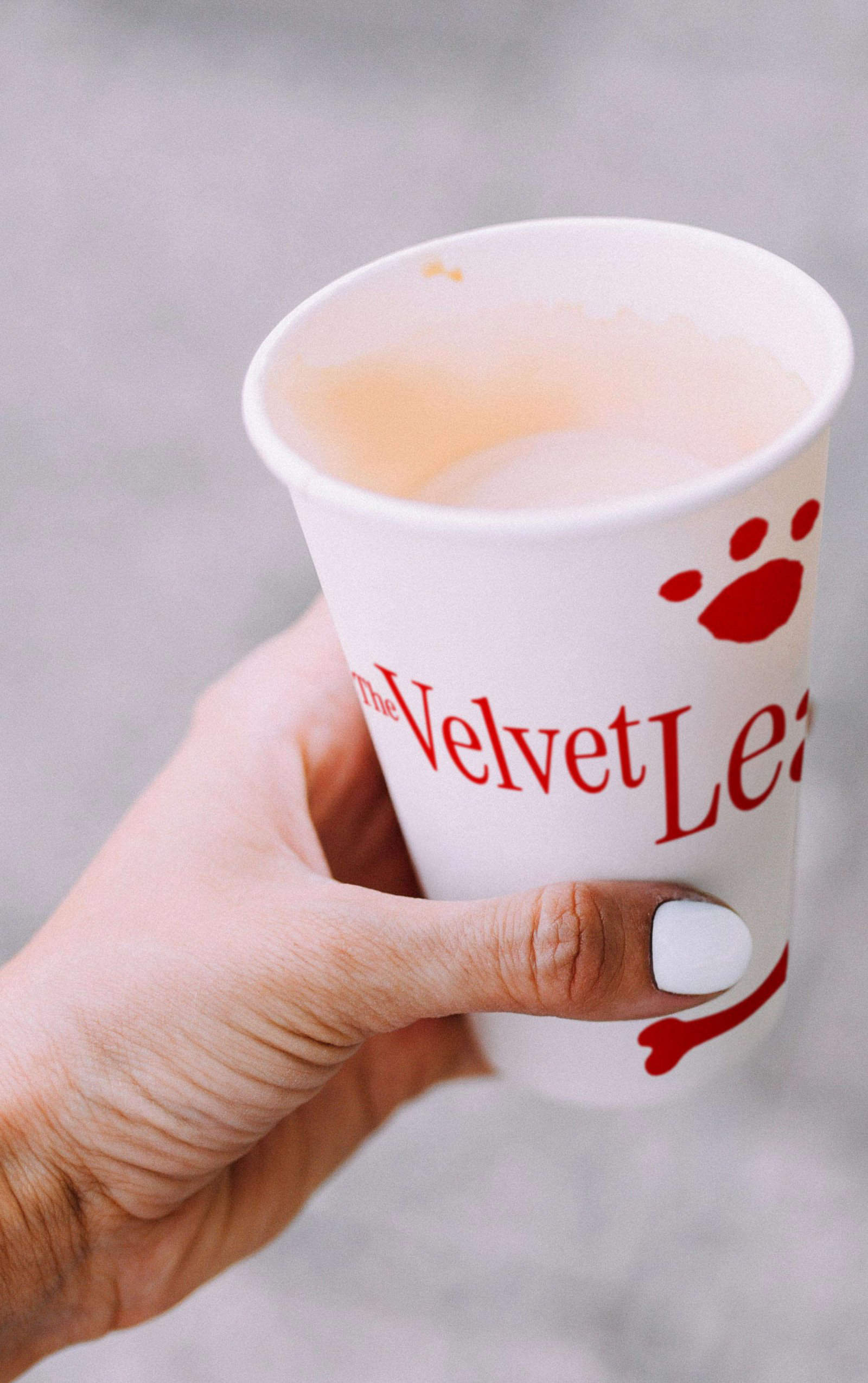
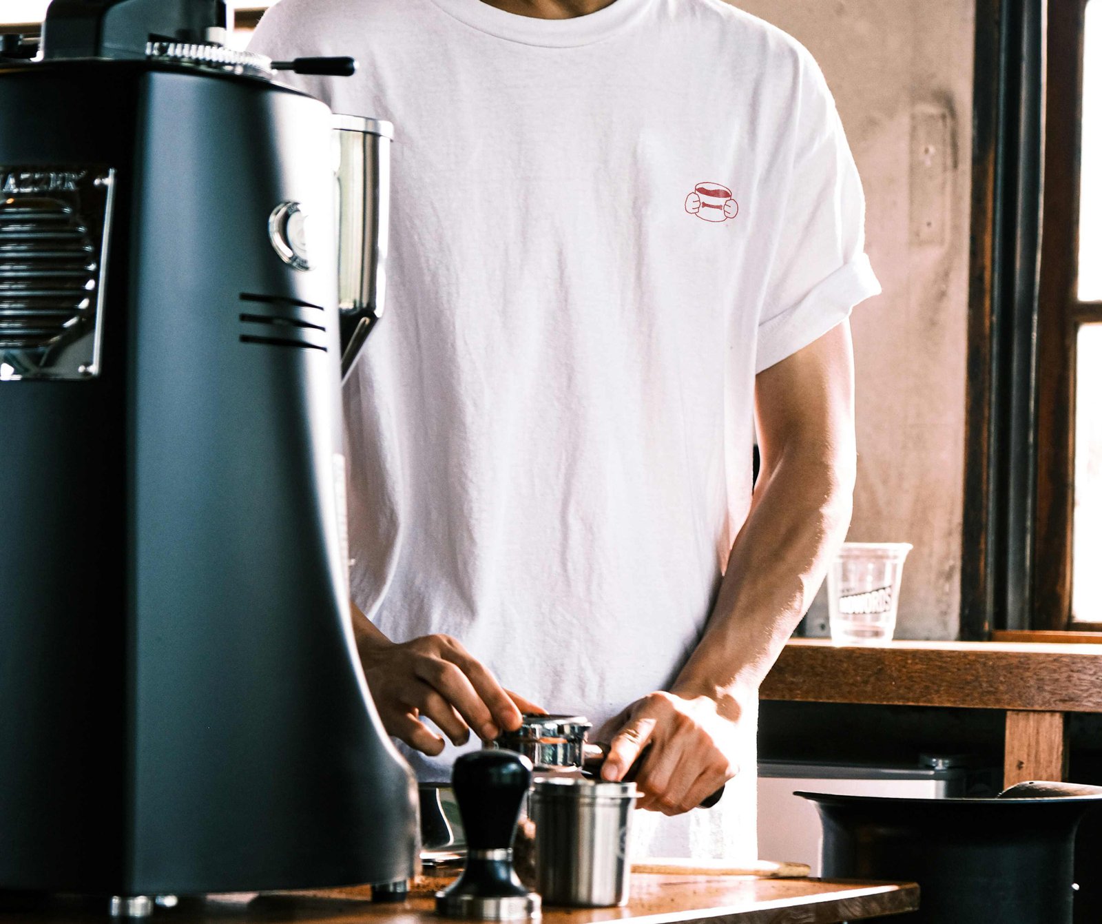
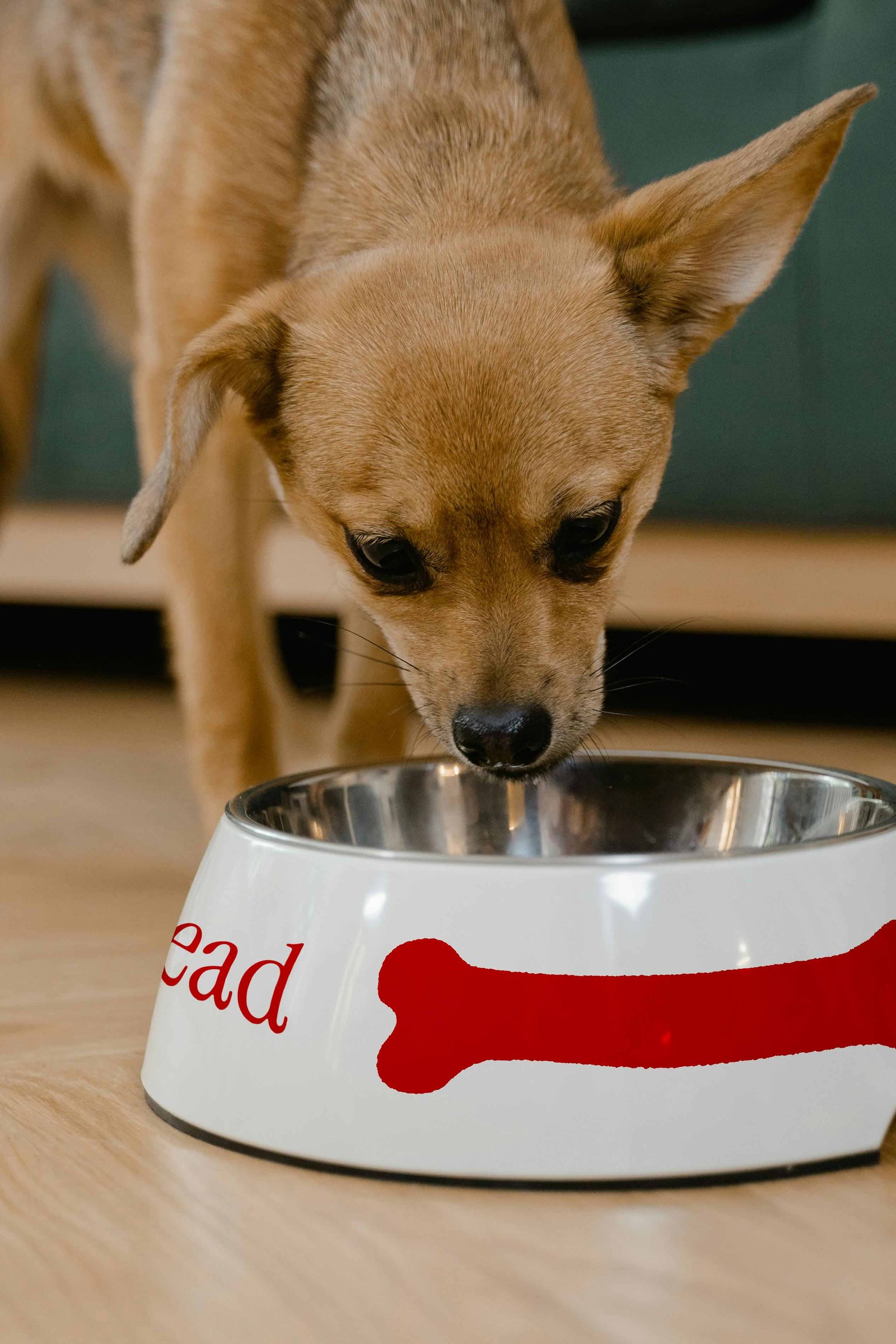
The brand comes to life through practical touchpoints such as pup-cups, barista t-shirts, coffee cups and dog bowls. Each item reflects the balance of quality and playfulness, building brand consistency that makes it memorable and easily recognisable.
